State of the Art: Burly Men At Sea
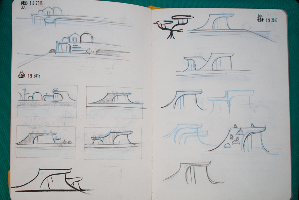
Seafaring sketches
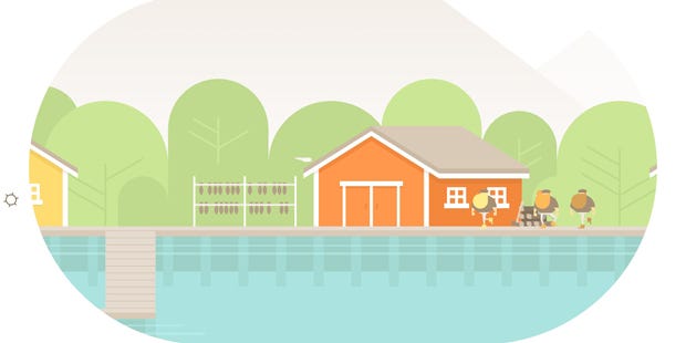
Burly Men At Sea [official site] sailed onto my radar at Rezzed earlier this year. Part of the Leftfield Collection, the game offered a beautifully stylised tale about three bearded brothers going off on an adventure. The reason I was particularly excited was, more than any other game, the demo I played seemed to capture the essence of children's story books and translate that to the screen in a way that felt natural.
To find out more I spoke to one half of the development team at Brain&Brain, Brooke Condolora and asked her to share snippets from her sketchbooks and from across the game's development.
Take a peek after the jump, and click on any of the images to see a larger version.
Pip: Hi Brooke, can you tell me a little about each of yours and David Condolora's professional backgrounds and what led you to form Brain&Brain?
Brooke Condolora: David was an assistant editor on films at Pixar and Disney, and I was an independent graphic designer and web developer. We’d worked together on a few creative projects over the years, usually short films, but they tended to lean more toward David’s skill set than mine. So when he happened to see a screening of Indie Game: The Movie at work, we both realized suddenly that making a game together would be the perfect outlet for both our skill sets. On top of our shared love of storytelling and related professions, David had some experience with programming, and I’d been learning to animate. It maybe goes without saying that we already loved games, and that they’d had a big impact on our childhoods. Everything about the choice was easy. So we spent a couple of years making a small adventure game called Doggins, then jumped in full-time to develop Burly Men at Sea.


Pip: What was the inspiration for Burly Men at Sea?
BC: We’d come up with the name years before we got into games, so when we were talking about what kind of game we wanted to make after Doggins, I pitched it as a folklore-inspired seafaring adventure about three bearded men. The gameplay evolved quite a bit along the way, but the story became exactly that. It felt natural to give the game a Scandinavian setting, so every creature or phenomenon encountered during your journey is drawn from that region’s folklore (or, occasionally, that of nearby areas).
The appearance of the game was inspired by a mix of things: from the design of illustrated storybooks like Saul Bass’ Henri’s Walk to Paris, to the colors of paint traditionally used in Norwegian fishing villages, to the bright geometry of modern Scandinavian illustration.
Pip: Between Burly Men and Doggins I’d say you have a distinctive aesthetic – how has that developed?
BC: My background in logo design and illustration probably had the biggest impact on the look of both, though I don’t think I really had a cohesive style before Doggins. In the design world, there’s a divide over whether it’s better to be flexible and adapt to any aesthetic a project called for, or to develop a personal style that clients would seek out. I tended to be the flexible type, but I think making games changed that.
Doggins was the biggest project I’d ever tackled, and I had no client to tell me what it should look like. I tried a few directions before I had the idea of giving it a midcentury sci-fi look, which put me on the path of geometric shapes and bright colors.
At the time, I was working in vector, but the final art also had a texture process to give it a screen-printed look. That part was extremely inefficient, so for Burly Men at Sea, we decided to use purely vector art. Visually, it’s not too much of a leap from mid-century design to modern Scandinavian illustration, so Burly Men at Sea was a natural progression from the Doggins art style. I guess it was obvious from the outside all along, but I haven’t really thought of it as my art style until maybe the past year.
Pip: Can you tell me how the look of Burly Men at Sea changed over time?
BC: While the overall style didn’t change all that much, the character designs for the Brothers Beard went through several iterations early on. We weren’t sure at first how stylized we wanted the characters to be, so it was their final version that really directed the look of the rest of the cast.


We never intended to use pixel art for the game, but working in giant pixels helped me think in terms of simple shapes.

Even after the basic design for the characters was finalized, we felt that beanies were a little too modern. Giving the men brimmed fishermen’s hats added character and helped clarify which way they were facing, which had proven difficult without faces.
Similarly, the fishing village determined the color palette for the rest of the game. Since that location uses the widest range of colors, I made a series of tiny color sketches to work out which shades functioned best together. The rest of the background art in the game uses varying shades of that core palette, and the characters are designed with colors that contrast best with those.


Pip: The animations – particularly the scene transitions and the way the play space is shaped or alters as you play – feel really important in creating the overall aesthetic. Can you tell me about those? How you worked out what you needed and how to make sure it wasn’t distracting or overcomplicating the experience?
BC: A big part of that was making sure we created a consistent experience throughout the game. We didn’t want to just make a game about folklore, but to take that further and give every aspect of the game the feeling of taking part in the telling of a story. Well-designed storybooks like Henri’s Walk to Paris use simple and often stylized visuals to communicate, so we were inspired by this to use the narrative sequences as a chance to break away from the linear, fixed camera angle that a 2D game is usually limited to. We could use them for things that wouldn’t work in a wide shot: closeups of small objects, backgrounds condensed to outlines, partial animations. We then tried to use these in creative ways to bring the characters from one scene to the next seamlessly.


We usually found it worked best to open a narrative by dropping out everything but the characters and a tiny bit of their environment. That small part of the background helped to ground any animations happening in the scene.
Pip: Which were the hardest parts to get right in terms of their look or to translate into your game’s style?
BC: Human characters were difficult to draw in such a simplified style, and once drawn, they were sometimes even harder to animate. But they had to feel human enough to tell a believable story, even without faces. Interestingly, in the game, only the nonhuman characters and animals have faces. That wasn’t necessarily a conscious decision at the time, but looking at it now, I think it was because I wanted the village to feel like anyone’s village, and the player to sort of see through the Brothers Beard in the way that a reader shares a story with the protagonist.


Another difficulty I didn’t expect was having to write in a way that fit the layout, in short sentences. I could almost publish the entire script as a series of tweets! I think it’s made me a better writer, but I do worry that it will be weird to go back to writing longform.
Pip: From the demo, Burly Men reminds me so much of the children’s books I read or played with as a very young child – was that the effect you were aiming for? If so, was there anything that particularly helped to achieve that effect?
BC: Definitely. From the beginning, we wanted to give the game the tone of a folktale, and the idea of using a viewport to create moveable vignettes took that even further. Visually, it started to resemble an illustrated book, which in turn gave us the idea to give the narrative scenes a book-like layout. We also chose a typeface to fit that storybook feel, and tried to push the staging further during narrative scenes, so that the action sometimes even affects the text and viewport.
Pip: Who are your inspirations? (artists, designers, animators, filmmakers…)
BC: For Burly Men at Sea, some of the artists I looked to for inspiration are Finnish illustrators, like Sanna Annukka, Lotta Nieminen, and Polkka Jam. Robin Davey’s animation work was an inspiration for the way he’s able to bring life into very clean shapes. And I’m a huge fan of Irish animation studio Cartoon Saloon’s intricately geometric art style and storytelling.
Outside of the game, I’m inspired by design legends like Alvin Lustig and Saul Bass, Hayao Miyazaki’s films and manga, and J.R.R. Tolkien’s incredible feat of building an entire fantastical world that feels as if it has always existed. I’m also super inspired by the scrappiness of early animation at Disney and its parallels to what’s happening in games right now.
Pip: The game feels so touch-screen-friendly with the click and drag movement system. Was it hard to get the effect you wanted on PC with a mouse interface as opposed to the mobile versions?
BC: The strange thing is that the idea for the dragging mechanic actually started out with PC in mind, and touchscreen happened to feel even better. Maybe it’s because I don’t usually play games on my computer, but it didn’t occur to me at first that no one was doing that kind of movement in PC games. But because we developed for both platforms simultaneously, we were able to design for each in a way that is most intuitive to that interface. For the PC version, we use a custom cursor designed to look like a ship’s wheel that turns as you drag. With details like that, players seem to catch on to the unconventional controls surprisingly quickly.


Pip: Which scene or visual effects are you proudest of?
BC: I think I’m most proud of the set of branches that change the way you think about the viewport mechanic, toward the end of a playthrough. Early on, when I was developing the structure of the game, I had some trouble working out what that mechanic meant to the story as a whole and how we could sustain it in a way that it didn’t become tedious to the player. At that point, I came across the Japanese concept of kishōtenketsu, or four-act structure, which Nintendo uses in its games. In it, you develop an idea over the first two stages, then suddenly take this idea in a new and surprising direction.
In Burly Men at Sea, this manifests itself in the scenes where the viewport is suddenly more than a window and becomes the thing itself: the jaws of a leviathan, will o’ the wisps in a cave, a waterfall. Those are probably my favorite scenes in the way they came together.
Pip: You’ve decided to make the story available as a physical book for players to buy once they’ve finished the game. It reminds me of how in Firewatch you could order your in-game camera photos as physical prints at the end. Firstly, were there any challenges converting the story to a paper version?
BC: Fortunately, we have a solid starting point in that a lot of the creative aspects were already worked out for the game itself, and I actually wrote the original script in long-form prose. I do plan to work in a modified art style for the books, rather than reuse assets from the game, so there will be quite a bit of additional work involved. But it’s important to us that the books stand on their own as good books, not as adaptations. There’s a subtle difference between a book adapted from a game and one inspired by it. We want to make a book that feels as if it could’ve been pulled from a shelf in the game’s world, so that you’re getting a book about the story you told, not just the game in book format. But it’s definitely a weird challenge to make art inspired by your own art.
Another challenge is that because it’s a branching story, we’ll be creating several variants of the book. Some of those have only minor differences, but we’re essentially publishing a multi-volume set.

Pip: And finally, do you think there’s a desire for physical souvenirs of a game like Firewatch or Burly Men At Sea that’s different from traditional merchandising?
BC: I think so, if done well. One example that made an impression on us was from Kentucky Route Zero interlude "The Entertainment." Tucked away on their website was a link to order a "paper and ink" copy of the script from the in-game play. Now we have this paperback from the game world sitting on our real life bookshelf, and something about that crossover really appealed to us.
Pip: Thank you for your time!
Burly Men At Sea is out on PC on 29 September.