Into the Breach's interface was a nightmare to make and the key to its greatness
The UI is your greatest weapon

This is The Mechanic, in which Alex Wiltshire invites developers to discuss the difficult journeys they underwent to make the best bits of their games. This time, Into the Breach [official site].
“I think we were resolved to having a UI nightmare from the beginning,” says Matthew Davis, co-designer and programmer of Into the Breach.
“When we decided we had to show what every enemy was doing every single turn, and that every action needed to be clear, it became clear how bad that nightmare would be,” says Justin Ma, its co-designer and artist.
Into the Breach is a tactics game from the developers of FTL about taking a team of three mechs into battle against giant bugs in a last-ditch defence of Earth’s cities. Rich with different strategies to master and challenges to vanquish, it’s deep, complex and “near-perfect”. And yet Ma says that he and Davis spent half of the four years the game took to make on… its UI. Its UI! The truth, however, is that the UI is a big part of what makes Into the Breach great, even though it also ended up transforming its very nature.
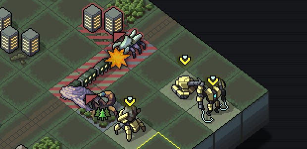
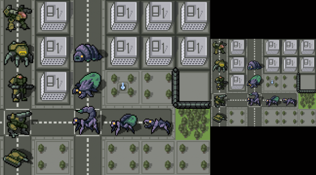
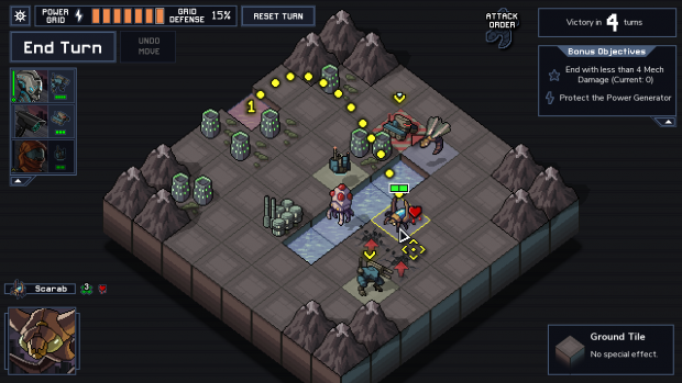
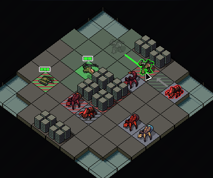
The key to Into the Breach is that you always know exactly what the bugs are going to attack next. You see what damage they’ll do and what kind of attacks they’ll make. It’s a game in which you have almost total knowledge, but you’re also outnumbered, and that means your turn is about using your knowledge to disrupt the bugs. Push the leaping bug so it lands on unoccupied wilderness instead of your city, and let your mech block that other bug’s shot. Every turn is a little puzzle box as you try to pull apart the bugs’ plans so you can survive, and it all hinges on you knowing the exact nature of the threat ahead and the exact consequences of your counter to it.
“Our requirement that the player has to understand what’s going on in any situation restricted our game design options considerably,” says Ma.
That’s why mechs and bugs only attack in three different ways. Melee hits the adjacent tile; projectiles fire in a straight line and hit the first obstruction; and artillery can target any tile in a straight line. “For a while we had the ability to target in the traditional three-tiles-range manner, in that diamond shape, until we realised that when we tried to show many enemies’ attack options at the same time you wouldn’t be able to tell who’s attacking what,” Ma continues. The board became a mess of hatched lines denoting targeted tiles which was impossible to read.
“I personally don’t like having to investigate shoot radiuses every other turn, moving a unit to check I can hit from there or to count tiles,” says Davis. “It becomes unmanageable to hold in your head and to eyeball what can hit what. From the beginning I wanted it so you could parse the board at a glance, so you wouldn’t have to investigate and double check radii.”
Making clearly defined attack types meant throwing out some complex weapon effects, such as hitting a star- or triangle-shaped area, because Davis didn’t like the game turning into an exercise in mentally rotating shapes to work out the results of a shot.
“I would like to interject that I thought it was fun!” says Ma. But he concedes it was totally impractical. “You could just see all these damage indicators all over the map. We were fine with that because we knew exactly what every enemy did and knew who could do what, but it was very clear, as soon as we handed it to someone else, that we needed to make it very clear who was doing what.”
And so artillery was given a looping line to show its trajectory, projectiles a dotted line, and arrows for melee attacks. Each of these little solutions came into the game piece-by-piece as Ma and Davis watched playtesters fail to understand what was happening. Their aim was for the player to intuitively grasp what the weapon did and how it worked, an ambition which forced out some weapon designs which were just too complicated to communicate to players.
For example, for a long time the game featured an earlier iteration of a boulder-lobbing one which ships in the final game. The final version of this is an artillery weapon, but the earlier one worked as a projectile and yet could be aimed to hit any tile along its line. It was already breaking the rules of the game - no other projectile weapon works like that - but it also had another rule: if it hit an enemy, it would drop a boulder in the tile in front. “That was fun, it created interesting decisions and it was nice to hit an enemy while blocking another,” says Davis. “You could do really cool things with it.” But it was unintuitive and difficult to describe.
Similarly, many weapons push units but none push further than one tile, and there are no special cases where, for example, pushing on ice slides them until they hit an obstruction. “It’s very hard to convey,” says Ma. “We thought that having a simple push makes it easier for people to understand what’s going on.”
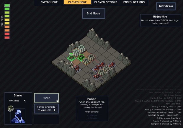
The primary way Into the Breach teaches you how weapons work is through tooltips. Select a unit and mouseover a weapon in the UI and you’ll see a little animation, complete with the actual unit wielding it, showing what tiles it affects and how. It’s a wonderful resource, and part of a philosophy of giving new players access to all they need to know while exposing a simplified UI to players who are already aware. But they weren’t always animated. “We found the language to describe a weapon was getting overly complex,” says Davis.
“Oh man,” says Ma.
“It was so complex to describe some of these weapons. We’d watch a playtester investigate a weapon and they’d just be like, ‘What’ after reading three sentences and still didn’t get it.” The tooltips included images, but because they were generic and didn’t show the unit involved, players had difficulty relating them to their situation. So Davis tackled the thorny challenge of making the tooltips dynamic so they’d always show the actual unit in order to make the weapon’s function explicit.
“I still think it’s the most important decision we made about this,” says Ma. “You could type out a hundred times, ‘Damages a tile and pushes adjacent tiles,’ but showing that little animation of them moving is a thousand times more effective. It’s funny.”
“It’s one of my favourite little things in the game,” says Davis.
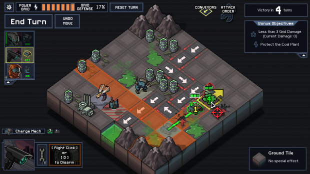
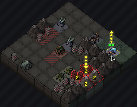
What weapons do is only part of the information-storm the game has to deliver to you. There are various environmental effects to get across, such as dust (unit cannot fire), fire (unit begins burning and takes one damage per turn), A.C.I.D. (unit begins taking double damage) and many more. But as simple as they are individually, the logic by which they’d interact was much tricker to untangle. What if an A.C.I.D. tile catches fire? And how do you show it?
“We thought we might add more islands and effects and stuff but every time it would open up 10 more questions like that,” says Davis.
“What if a unit is frozen in ice and then you push them on to fire using an A.C.I.D. attack that doesn’t do damage. Does it break the ice? What happens?” says Ma.

Each of these interactions had to be hand-designed according to what made intuitive sense, and they tried to stick to tiles only carrying one effect at a time. So you can’t have a mine with A.C.I.D. on it, mostly because it would be impossible to display both on the board at once.
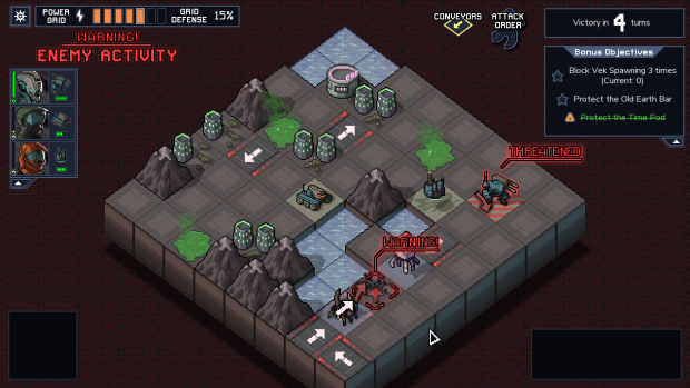
But when push came to shove and the intuitive approach for solving corner cases ended up in having to show more information, the general solution was putting an icon on it. You see them across the game, from the tiles where bugs will erupt from the ground next, to the cities and units that are under threat. But this approach, too, caused problems. “One and a half years ago the game was just an icon mess,” says Davis. They would add icons whenever they saw playtesters miss relevant pieces of information, and the screen built up and up with them. As for weapons, the solution was editing. “Just as a game design principle, we would sacrifice cool ideas for the sake of clarity every time,” says Ma. “If it can be shown in a clear way, yes, we can have that.”
And that meant that many of Ma’s visual ambitions for the game, such as burn marks on tiles that have been attacked and scenery getting stomped down by mechs, had to go, too. Not that he’s remotely concerned by that.
“I don’t even think we have the best solution,” Ma continues, brightly. “This could be way better. But it’s entirely functional, in our opinion.”
”That’s the frustrating part, really. I don’t think either one of us consider ourselves particularly great UI designers,” says Davis. “I think we brute-forced this into something that works, rather than used our own design brilliance to come up with a solution.”
”I think we know what we don’t like,” says Ma. “We’re not great UI designers but we have a clear understanding of what we don’t like, so it came down to just hammering on it until we found something that was OK.”
(Into the Breach’s interface design is a lot better than OK.)