Cities: Skylines - The Great Blueness
Colour wizardry
An experiment with colour mods in Cities: Skylines...
Long ago there were no colours in the world at all. Almost everything was grey, and what was not grey was black or white. It was a time that was called The Great Greyness.
Every morning a Wizard who lived during the time of The Great Greyness would open his window to look out at the wide land.
“Something is very wrong with the world,” he would say.
“It is hard to tell when the rainy days stop and the sunny days begin.”
- Arnold Lobel
One of my favourite children's books is The Great Blueness And Other Predicaments by Arnold Lobel. My copy is tatty through reading and re-reading; not so much dog-eared as it is utterly lacking in corners and the laminated cover has those yellow-brown veins creeping across it where it's been creased and straightened.
The Great Blueness is a book about colour – the joy of colour and the power of colour. The Wizard in the story spends a lot of time in his basement mixing up spells and potions to distract from the greyness, eventually discovering "blue". At this point he and the rest of the townsfolk lose their collective shit. They paint EVERYTHING blue because it's the most exciting thing in the world.
For a while life is brilliant, but then everyone gradually gets sadder and sadder because of all the blue. Similar things happen with red (rage) and yellow (headaches) as the people try to live in these monochrome worlds. Finally the wizard's desperation means he creates primary colours in a frenzy. It causes his potion pots to overflow and the colours to run into one another, creating a rich and varied enough palette that the people can repaint the world the way we see it now.
I like that story because it speaks to the same joy and visceral reaction I have to colour. But colour of physical objects and colour on a screen are different experiences. I find physical colour – pigment – attractive in a very particular way. I want to touch it as much as I want to look at it, jamming my hands in powdered pigment or running fingers over paintwork. International Klein Blue is one example – it's a kind of ultramarine shade but a lot of its appeal is in its matte, almost velvet, finish. It verges on luminescent and demands attention. Similarly, there are rich greens I adore in and out of galleries. They don't translate to computer screens, though.
Looking for a copy of The Great Blueness to gift a young relative I decided to make my own Great Blueness in Cities: Skylines. There are a number of mods which easily let you switch to a monochrome look. I downloaded the screen primaries – red, blue and green – as well as a few greyscale options and set about touring my city.
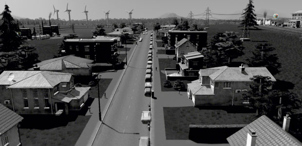
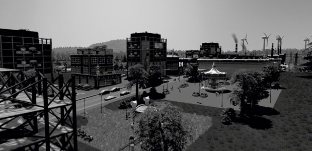
The Great Greyness
The Great Greyness is not so great. This isn't because greyscale is boring, but the colours lend charm and personality to the world. Slipping into greys removes that element and the world feels more disjointed, more obviously modular. The colours no longer soothe transitions or give blobs of visual unity. It feels less like a city and more like an architectural model. After a while a bleakness creeps in.
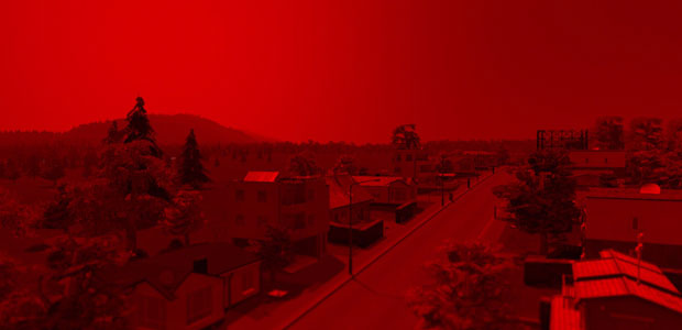
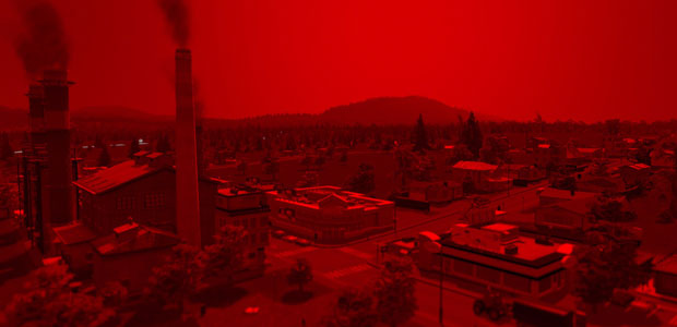
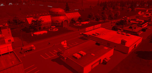
The Great Redness
The Great Redness is like I've taken The Great Greyness into a darkroom and pegged it up on a photo line. It's oppressive and the lower brightness makes it harder to discern detail. It's like living under Sauron's Eye or something.
Unlike the denizens of Lobel's world, I'm not getting angry in the face of all the red, just a bit squinty and headachy, making excuses to look away from the screen.
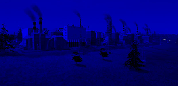
The Great Blueness
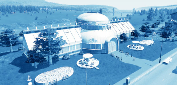
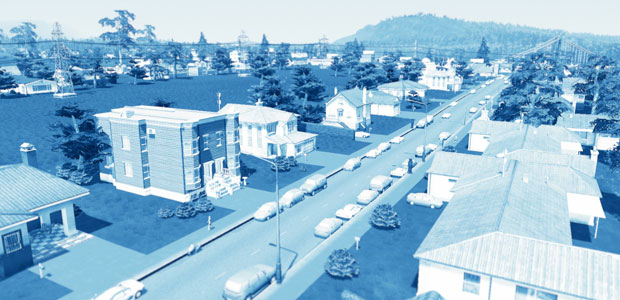
The Great Blueness is even darker. It's turns my city a wonderful ultramarine but loses so much light it's like I've switched on a nighttime mod. It's as soothing as The Great Redness was oppressive, but I start to yearn for daylight. Trying to fudge the project a little I pick out an alternative blue mod:
It's far better in terms of being able to pick out the fine detail and I'd prefer to play in this Blueness, but it feels closer to an Instagram filter than a visceral punch of colour.
The Great Green-ness
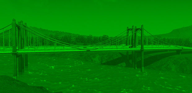
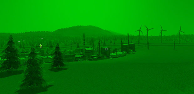
The Great Greenness is awful. I hate the whole experience and switch it off almost instantly which is why there are two screenshots instead of three. It hurts my eyes when I look at it, the shade is gross and I don't want to look at anything it touches. The city is horrible. A canker with a wind farm on the side. I would nuke it from orbit if there was a button to do so.
The Great What-next-ness
So how does my Cities Skylines look now, having taken it to three visual extremes? Well, Arnold Lobel's tale ends with balance and a pretty equal representation of all colours, primary, secondary and tertiary. I am not Lobel.
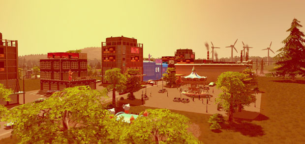
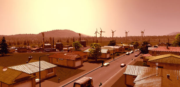
I spend the next hour running through a handful of other mods and settled on two to keep me happy for now. Both have strong red elements to them. Scorched has a hot, burnt-out desert town vibe. XAVE Mars is similar but allows for brighter greens and yellows - it's the part of the morning before the heat hits, whereas Scorched is the dusty long afternoon crawl towards twilight.
Speaking of which, there are some soothing moonlight and twilight purples in the workshop which I'll keep in reserve for when the reddish orange inevitably makes me crackled and bad-tempered.


